What We Learned Studying the World's Best Studio Websites
We spend a lot of time studying websites we admire. Not just looking at them, but pulling them apart. Understanding why they feel the way they do, what decisions were made, and what we can learn from them. It has shaped a lot of how we think about our own work.
A few patterns show up consistently across the best ones. They aren't secrets, and they aren't accidents. They're decisions, made carefully and applied consistently. Here's what we keep coming back to.
The Work Is Always the Focus
The strongest studio websites get out of their own way. Navigation, layout, and transitions all serve one purpose, directing attention to the projects. Nothing competes with that.
This sounds simple, but it's easy to get wrong. Oversized headers, busy backgrounds, and aggressive animations all pull focus away from what the site is actually there to show. Every design decision is either supporting the work or undermining it. There's rarely a middle ground.
Restraint Is a Design Decision
The sites we admire most are defined as much by what isn't there as what is. Limited colour, generous whitespace, quiet typography. At first glance they can feel minimal to a fault. Spend time with them and the intention becomes clear.
Restraint is not a lack of effort. It's the hardest thing to get right. Stripping a design back to only what's necessary, and having every remaining element feel considered, takes more discipline than adding. Their sites feel calm because every decision was made with purpose.
Structure Creates Confidence
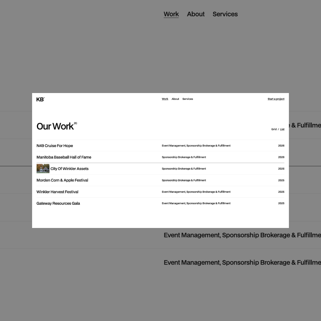
Visitors to a well-structured site move through it without thinking. The hierarchy is clear, the flow is intentional, and the next step always feels obvious.
Poor structure is one of the most common issues we see in portfolio websites, even visually impressive ones. A visitor who has to think about navigation is a visitor who is no longer thinking about the work. Information is layered thoughtfully, projects are easy to explore, and the overall experience feels guided rather than accidental.
Performance Is Part of the Presentation
A beautiful site that loads slowly undermines itself immediately. For creative studios, where presentation is directly tied to perception, this matters more than you probably realize.
The studios with the strongest web presence treat performance as a design value. Images are optimized without sacrificing quality. Transitions are smooth and purposeful. All of it contributes to an experience that feels as refined as the work being shown.
The Contact Path Is Never an Afterthought
Every strong studio website makes the next step feel easy. The best sites treat inquiry as a natural continuation of the visit rather than a separate task.
This is where a lot of otherwise strong sites fall short. The work is presented beautifully, the structure is clear, and then the contact page is a form sitting alone with no context. The studios that get this right think of the contact path as part of the design, not an addition to it.
The Gap Is Almost Always Intentional Thinking
What separates a good portfolio website from a great one is rarely one dramatic difference. It's the accumulation of small, considered decisions applied consistently. Nothing feels unconsidered. Nothing feels rushed.
That's what we think about every time we start a new project. If your studio's site isn't reflecting the quality of your work, that's exactly the kind of problem we solve.